E+E UI App research
- Meg Glover
- Feb 8, 2020
- 9 min read
Updated: Mar 29, 2020
Resources:
Because I have decided to implement the UI design of an app into my project, as the user's 'relaxation/chance' tool, it is important for me to gather knowledge about successful apps not only revolving around the same topic but also those with good interactive features that help navigate the user seamlessly.
Headspace
What is Headspace?
As it says in the name, Headspace is a gamification app that lets its users concentrate on themselves without worrying about the outside world to enhance and improve a way of thinking. Headspace is a suitable app for me to research, as suggested by Ellen during the presentation because its purpose is to relax its audience and create that break between the digital and physical boundaries in today's modern world. My presentation lacked research evidence, which was noticed by my peers, despite having completed personal research into apps like Headspace and Clue beforehand I did not include visual slides about this process in my presentation and therefore was lacking in this area.
Headspace also offers users to share their progress with friends which not only allows the users to act on their mental health together on a motivating platform but also allows the topic of mental health (something that is still seen taboo in many countries) to be brought up in conservation, the app is almost an awareness technique. The app oversimplifies meditation, making it easy for those who don't have time or interest to learn the basics but may lack in-depth towards those with spiritual beliefs.
Audience: After being launched in 2010 in London by creators Andy Puddicombe and Rich Pierson, Headspace has a total of just over 31 million users around the world where over 250 companies offer Headspace to their employees as an escape from a stressful working day.
Headspace is targeted at those who spend a lot of their time on digital devices, such as typical graphic designers for example, but mainly for adults with a desk job or other straining jobs. Although it also has a Kids feature which suggests it is also useful to calm down youngsters who spend their playtime on their parent's iPad.
Cost: The disadvantage about Headspace is that users have to pay for it as a subscription - a huge turn off for students like me and therefore I would want my own app to be free to everyone because access to mindfulness and relaxation activities such be included in people's daily life in order to achieve a healthy stress-free and happier lifestyle. Even though the cost of the app can be seen as a disadvantage like this, it also acts as a hook for Headspace's users because they will be more inclined to use a service that they paid for than rather waste their money by pointlessly not using it to their advantage - therefore acting a pressuring reason.
$125 million has been spent on this app by customers as a total calculated by November 2019 suggesting that this app is increasingly popular among today's society and works due to its feeling of 'wanting more' almost like a rewards or loyalty card system. Some of this money is put back into the app, to bring out new features (such as the sleep and waking up meditations) that meet what the audience wants. It is also put into ads seen on social media, using cookies to target certain individuals like myself where I first heard of the app via an advertisement on youtube that I was watching on my smartphone - a handheld device where this app would be most convenient.
UK Users can choose from a £9.99/month or a huge saving of an annual subscription of £49.99/year.


Above are images of the app at work sourced from the Google Play Store, which I saved while downloading the Headspace trial,. Personally I feel really attracted to the 'sleep course' page because of its dark colour palette that would be comfortable on the user's eyes during nighttime. It also subtly matches the colour theme I have used within my own project and therefore may choose to adopt something similar. The designer has been careful about what colour to use because making UI dark themes can actually be quite challenging due to the glare/glow created when light or white text is laid on top of a dark or black background. To combat this the designer has instead used a lighter blue for the main font colour, along with a gorgeous neon peach colour which compliments the depth of the purple background perfectly.

After downloading Headspace onto my android device I completed its trail activities which focused on meditation samples. Due to the amount of ambitious work I have given myself to do during E+E it is probably best for me to save audio clips for last (if I ever do develop the app) because creating a whole podcast playlist of medication voice notes would be beneficial to present my app but is not my project's main focus. Instead, I turned my own focus onto the user interface and experience of Headspace asking myself the following questions:
How many pages does this app have?
Because I only have access to the trial version this is a tricky question but so far I have access to a fair amount of pages, such as:
Loading Screen, featuring the Headspace typographic logo
Home/Landing page, featuring the user's current activity at the top and recent activity underneath. Directly below the user's current activity is 'everyday headspace' a meditation that refreshes every 24hrs. Accessible from the Home button displayed on the navigation button at bottom of the screen.
Library overlay allows users to browse different types of activities depending on what they need it for or how they're feeling, e.g sleeping. Once the user has clicked on one of these activities they are taken away from the overlay to the darkened page below, allowing them to play their chosen activity or 'course' as it's known in Headspace. Accessible from the Home button displayed on the navigation button at bottom of the screen.
Profile page allows the user to track their progress


Special functions - what are its USPs?
Animation for each meditation technique to visually help the user when not understanding voice/meditation commands
Tracks progress on profile page - making users come back for more to build up better statistics. Headspace even has a 'My Journey' tab within this page. Unfortunately, this page was inaccessible during my trail but from looking at screenshots on the web, it seems to be a visual timeline of past courses.
Cute characters, illustrated by Chris Markland are a part of the Headspace brand and are featured on most of the pages of the app, keeping the user engaged and wanting to unlock more images/animations of the characters as the user continues to complete courses. These characters create a playful atmosphere and light-hearted mood, making the users overall feeling more positive since cuteness releases certain 'happy' and 'feel-good' chemicals in the body. The characters have their own simplistic, modernistic and minimalistic designs that merge seamlessly well with the play of warm and natural colours within the app and due to their simple design, they are not too detailed for placement on a handheld screen. Characters like these were most likely created in vector software such as Adobe Illustrator and remind me of the created by Julian Frost for the mobile video-game Dumb Ways to Die. The bold expressions on these characters and similar to those featured in Headspace, allowing users to relate and laugh at their over-dramatic movements and personalities which strengthen the bond between the user and the screen.


"Creative Director, Anna Charity, and Illustrator, Chris Markland, understood that the concept of meditation is still something a lot of people don’t fully get. By personifying the mind as a character and distilling the style to a simple, almost childlike quality, they created something that people find easier to grasp and feel less fearful of, or silly trying"
How easy is it to navigate?
Personally I found the app extremely easy to navigate and therefore ignored the app tutorial that popped up when I first opened Headspace. This is because the UI has been designed with the digital-savvy user in mind, it features symbols and swiping across, up and down commands that we use on social media and the typical apps every day, such as an image of a house and a silhouette outline of a person to suggest the home and profile pages of the app,
However, in my personal opinion, I actually find the interface of the home page quite messy and unorganised - there is no clear design as it changes depending on your current activity. It has no uniqueness to it and instead is literally an arrangement of different sized boxes with some text laid on top. If I were to improve this design I would make it more functional by including all the navigational buttons on the home page - maybe it the buttons could be represented or situated inside different characters to make it more appealing and user-friendly because I feel like there is no solid purpose to the home page other than to tell the user what course they are currently involved in which could've been made much simpler by adding this an overlay to the top of the navigation bar, much like when a music application displays the song that is currently playing.

Overview
Even though I think I may find this app useful my main concern is that is it too expensive and until I have implemented it into my daily routine I have no idea how useful it would be to me personally. Headspace is more of gamification than a healful health system because it keeps its users engaged via a profile log which tells the users how many minutes they have meditated for using the app - but isn't this controversial? The whole point of the app is to give its customers a break from the world of digital.
Another useful feature it has, like many apps, is a notification that reminds users to take their daily medication exercises but when using the trail I found this to be quite annoying during tasks such as replying to emails etc although I do understand its purpose - to remind those who are spending too much time on their smartphones.
There are alternatives to meditation such as going to free yoga practice at UAL halls or simply following instructions or podcasts online but all of these may be less engaging to a digital age and therefore my aim will be to improve my app by including simple activities and instructions, to save users time, along with a better-equipped journey log that would map out my user's time spent on the app as well as the activities they have compleated. It may be also useful to include a mood tracker after or within the activities themselves so that, if my app were to develop in the real world, I could track people's reactions and emotions (with privacy disclosure of course) to evaluate what methods of relaxation are most popular/suitable.
Clue

The Clue app is designed for the ease of monitoring periods. To make tracking periods trouble-free, Clue has even included optional categories which allow the user to document symptoms that are useful for spotting unusual patterns. Users can also add their own categories (opting into a paid subscription), each having their own colour and symbol to represent different activities, moods etc, making it easy to choose and understand each topic. If a user doesn’t understand a certain a category, they can learn more via the information icon which is represented using an italic “i”. The app also comes with a calendar, using science, to determine the effects that their user based on previous data from the user. The extremely simple design makes the app less like a chore and encourages users to track their own pattern. However, what makes this app so brilliant is its intuitive design and engaging atmosphere - the home page is fitted with a useful cycle graphic that visualises a women’s cycle perfectly and its ease of use makes the app quick to open to close, along with its discreet design. The cycle fitted onto the home page vibrates when the finger is circled around it to find a specific time period ob the tracker, creating a satisfying feeling that is not overall necessary but definitely increases the user's engagement and appel experience to the app. I would like to experiment with these UX features, especially the idea of having a cycle graphic to visualise the clock, in my own app to create a fast way for users to access activities in times of need.
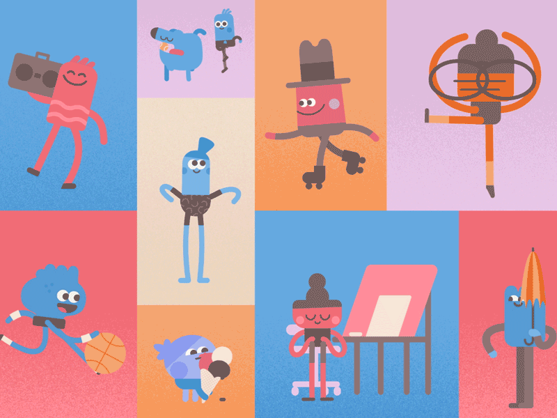
Mood Board
Design interfaces, icons, symbols and e-commerce for me to refer to when designing the wireframes for my app. As a designer, I have learned the cycles of images that circulate on Pinterest but it is still one of the main initial inspiration sources during the research stage, along with Dribble and Behance - sites which these images have been sourced from. As with any online search, images and content are always going to circulate, as I have seen my own images pop up among Pinterest boards where I have learned the importance of copyright, watermarks and tags from my own detrimental experiences of having my work stolen by customers.
One of my goals as a designer to be a content creator rather than a consumer and therefore throughout these platforms I hope to create successful projects and experiment with new techniques that will help others in needs of my inventions and also my online presence as a designer.


Comments