My Time - E+E open studio
- Meg Glover
- Feb 3, 2020
- 9 min read
Updated: Feb 12, 2020
Preparation
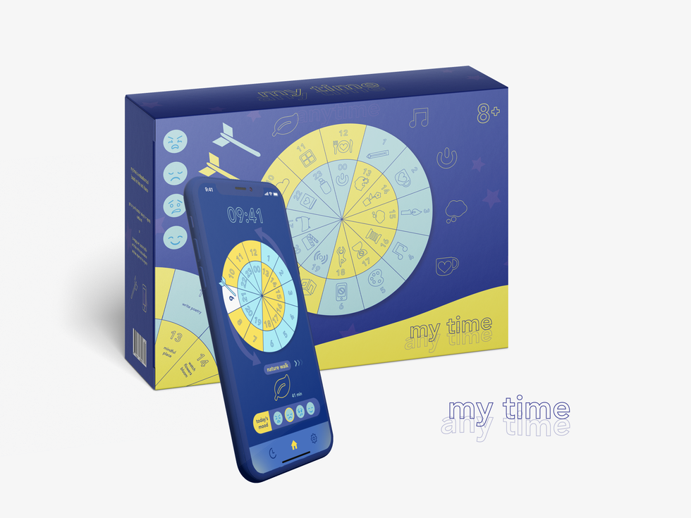
Today I presented my tool + map, collectively named 'My Mind - anytime' for my first platform: environment & experience as a 'work in progress'. Before displaying my work (in progress), a lot of effort was put into the thinking behind. Judgements about consistency, branding and the way my tool and map would be packaged and presented were made at this time in response to presentation feedback.
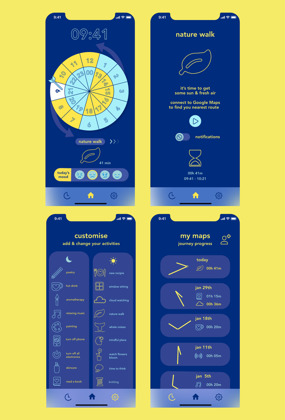
To make the magnetic dartboard I printed my developed design, now with symbol illustrations visualising each activity in response to an agreement during the presentation, on A3 thermal wax paper using the digital print workshop. These symbols are a combination of my own designs, designs I have used for past UI projects and icons I have sourced from Nucleo (an app library filled with ready-to-export icons) and Icons8 (a free web collective). To make these icons editable I image traced and expanded them using Illustrator.


As with my prototype before, I stuck my printed dartboard to magnetic paper, this time doubling it up to ensure a stronger magnetic field. To cut through the magnetic paper safely I used a scalpel and cutting map. When pressing my paper down onto the magnetic paper I didn't realise how much ink would come off the waxed paper, causing unnecessary and unprofessional-looking marks - something I should take more care with next time. Also, because I used Pritt Stick, the build-up on glue lead me to use a metal ruler to spread the glue evenly, also leading to markings.
Unfortunately, I spent quite a bit of money as I had to continuously reorder magnetic paper since I underestimated the amount I would need. This will lead me to approach my next projects with more thorough research + planning beforehand - looking into professional printing for example.
Again, I made sure to test out my dartboard and give all my preparation work a second look through to resolve any mistakes. This included adding command strips to the back of my dartboard to keep it secure - and to avoid causing any damage to the wall and my peers (most importantly).
Brand Assets

I created my captions, instructions and mockups in Illustrator using a library of assets to keep up with my consistent blue & yellow/day & night theme. It is important to use consistency within branding because it allows your audience and potential customers to spot and relate items/motifs/advertisements/logos etc to a single brand. This works incredibly well with global companies such as Google and McDonalds and therefore is good practice for me to replicate in my own work. Having a unique brand identity is especially important to new brands and businesses that want to promote themselves and gain recognition, because it makes it easy for their audience to clock what belongs to a brand, not just by the logo but by recognising that the same fonts, colour palette and visual styles have been used.
Open Studio
When preparing my work in progress for the open studio I did not take into consideration how I would present my process and therefore did not have access to show how I generated and developed my idea. This is partly to do with a) my sketchbook literally fell apart (tragic!) and b) my laptop did not give me access to my blog - could have been solved with renting a laptop.
I might not have chosen the best placement either - but that is due to late arrival because even though I came to university early, I had issues with re-printing and cutting my brand elements in the library. However, luckily I came into college the Saturday prior to meaning that I had backup proof prints to display. Since my dartboard was not placed directly onto a solid wall it meant risking safety as coursemates may have hit peers - but this would have been a low risk anyway since my darts are blunt magnets.


Results
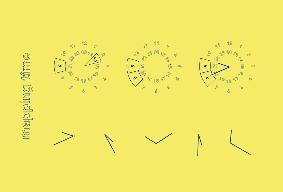
I did not show my final 'map clocks' line-art - instead, I only presented results that had been collected during prototype development because my aim at the open studio was to collect further results from peers - turning out to be a success! however not as many people participated as I had hoped. I will be turning these clock diagrams into maps featuring the line-art of the clock hands as each of my user's personal relaxation journey - just like how I visualised the results from my prototypes into the 'my maps' page of my app.

Progress review


Reference


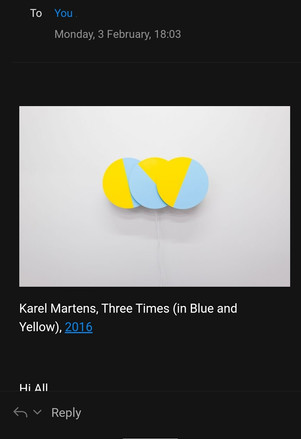
After compleating the open studio I received an email the same day preparing me for my next Unit 3 rotation - Digital. To my surprise, this email included the artist Karel Martens and his work Three Times (in Blue and Yellow). This is an example of how important is it to research practitioners, not only for design & technique inspiration but also to avoid unexpected plagiarism. If I had completed more thorough research beforehand then my final outcome may not have looked as similar to Marten's work as it does now, but unfortunately, it is too late and I do not have enough time to change the entirety of the colour palette in my brand identity. It is interesting, and may even appear speculative to some, that I used identical colours to Martens work, which also features his own depiction of a clock.
Three Times (in Blue and Yellow) differs from my design in that it features 3 circles, instead of 1, to visualise time. each circle represents a time unit, seconds, minutes and hour, which the three rotate, each at different speeds to revolve new shapes and hidden imagery once the colours overlap. Just like my own clock, which I finally represented as a dartboard using the same numbers seen on a classic clock, the circle is split into sky blue and light yellow - maybe Martens also had the same intentions to represent time as day and night using yellow to represent sunlight and the blue representing moonlight or lack of sun.
Reflection
I am satisfied with the outcome of my tool 'My Time' for the open studio for a number of reasons but have yet to refine my map as it would be useful to display the data collected from the studio, as well as further data from peers, flatmates and anyone who is interested in my project themselves. Of course, it would make sense to record journeys from those who match my target audience, but it may be hard to cover everyone because, for example, finding businessmen and office workers who have the time and willingness to trail 'my time' may be difficult to approach and I will, therefore, keep my aim towards students while hopefully branching out to older friends and family who I feel may benefit from a mindfulness escape from the digital and busy environment we are faced with as city workers.
Personally I think My Time is a successful project because of my own journey that I experienced while creating it. At first, I found the brief very difficult to get my head around which led me to ideas with the wrong motive, such as my tarot cards that were too complex for an audience to understand. I failed to understand the process which was to create a successful idea and prototype it over and over again before reaching a suitably designed outcome (although I did trail lots of experiments with coursemates and friends). For this, I should have focused on creating an understandable and suitable tool that would’ve been experimented on to gather outcomes and data to later form a map and justify ideas for the workings behind my tool. Instead, once I had an idea in my head, I began designing and thinking of its appearance straight away rather than building up to its abilities and weighing its suitability. To improve, in my next platform I should put my effort into making my ideas as purposeful as possible, as I am a communitive designer after all. I will do this by experimenting with techniques that allow me to communicate my idea clearly to an audience, allowing them to understand it straight away.
In my opinion, My Time was still a work in progress during the open studio and therefore I have yet to refine its details between now and submission, where I hope to improve my app by adding an instruction page and refine my dartboard by printing it on a stronger magnetic material since the darts would, at the majority of the time, hit but not stick to the board when thrown with a weak arm. To solve this problem, I may decide to order a magnetic dartboard from an eStore as these exist as toys for children, customizing my already existing design to stick on top one myself because at this stage I don’t have much time to think of a new suitable material. I should also work on making My Time’s instructions to make them easier and clearer for my audience to understand as some of my peers failed to do so in the studio since the captains may have been too wordy and therefore people were turned off from reading them or were drawn to other people's work more and wanted to get my project testing out of the way. This could be done using further imagery, such as diagrams, or implementing my video demonstration that the app that would pop up when the user first launches the app. If I had the access to get my app programmed and the money for a place to advertise my app in the IOS App Store or Google Play then that would also increase my chance of receiving data, of course only from those who choose to disclose private information. Instead, I should use social media and my Adobe Behance account to raise its popularity and recognisability by constantly improving my time's brand identity, which in the creative industry would work well using targeted ads based on personal cookies and advertising my dartboard as a product in-store while also collecting data on whether my audience would consider using it via questionnaires and making changes from there.
Personally I feel that I have met the accessibility requirements for my audience which I set myself during the prototype stage because I have removed all text, apart from numbers, away from my dartboard and replaced them with symbolic illustrations instead – great for kids and legible needs because now the activities can be seen from further distances with the flash of an eye, meaning that the user won’t have to waste time reading because in this case, pictures speak more than words. These symbols also add an element of freedom to my design because it allows the user to apply their own meaning to each symbol/activity. For example, the leaf symbol doesn’t necessarily have to entail the user to go on a ‘nature walk’ instead it could suggest another outdoor activity or a whole separate one altogether – such as playing the Nintendo video game Animal Crossing (proven to be a relaxation source) but this, of course, may differ my aim from giving users a break from the digital world. However, my symbols have all been borrowed from Nucelo and IconS, free online services that let UI designers use pre-made vectors. If I had more time to improve I would like to design my own set of symbols but from previous experience working on other app interfaces, such as for Organi and Cut it Out (a knife crime awareness app I made in college) creating symbols is a time-consuming task – especially when they all need to have the same 'feel' to make them part of a set and match the brand identity. Also, from watching Howard Pinksy's Adobe XD tutorials via Youtube during research, I found that professional designs use these pre-made icon packs too and this is where I found out about the Nucelo plugin.
Moreover, I still need to experiment with high levels of contrasts via a colour blind simulator. This should have been done at the start of my development stage because if I am yet to fail this then I will have to change my entire brand identity and everything I have made up until this point which would, of course, an extremely time-consuming task. Accessibility is one of my main goals of this project as I would like to make My Time useful for anyone who needs time to relax. I should also add a settings page to my app, letting my users customise font and colour settings which would be useful since they can already personalise their own symbols.
To improve my dartboard it would work well to somehow connect it to the app. For example, the result a user gets from the magnetic dart hitting the dartboard could determine the activity and appropriate timing via the app. Maybe the user could receive this data as a notification on their device. However, due to short timings and lack of resources, this may be too ambitious as of my current design skills.
Overall My Time meets the brief because I have designed a useful tool fit for a wide audience with a consistent branding style and a good element of chance, My Time is a fresh look on how a map can be created within the user themselves. Unfortunately, at this stage, I feel like my map, featuring line art of clock-hands, is not yet strong enough and I will work on developing this throughout the remainer of Unit 4.


Comments